Posts

Final Product !!

Image
 And drum roll… HERES MY FINAL PRODUCT!

Double Page Spread Final (+ Changed Decisions)

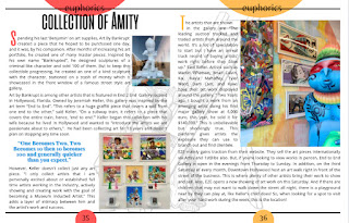
Image
  Hi this is my double page spread. I added the same circle thats behind the words, behind the page number. I also want to add I change the entire house style of the page. It’s very different from the draft one I did months ago. I got a new creative eye and I wanted to incorporate the colors from the photos into the elements I added around the page. I decided to add another photo so my feature lead makes more sense. I wanted to also incorporate a sketch piece behind the text as a motif in my magazine. Mainly because I believe it makes the page less blank. I also want to add that I incorporated fonts from the cover photo such as the font of “Best art gallery” to have as the title of the feature article because I want a sense of unity.      

Double Page Spread Draft

Image
     Here’s my double page spread draft. I have to add in the article and little touches such as photo placement, page number, fonts, etc. 

Table of Contents Final (+ Changed Decisions)

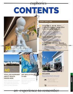
Image
      I also finished my table of contents. I did change some things and here’s my reason why:     I introduced a photo of a clothing shop to incorporate a story about clothing. I changed all the titles and summaries to stories that would fit my magazine also. I changed the color of the date release from yellow to green so it looks more uniform with the number of the edition. And as stated before, I relocated the “an experience to remember” to the second page, instead of the first  

Table of Contents Draft

Image
 Hi, I started on my table of contents but I haven’t changed the template for some of the story titles. I’m still deciding on photos but I’ll see which ones I want to change it to.  I have to change: - titles for the stories - colors for the page numbers and the colors of the date the magazine released - change photos if I don’t feel satisfied with the photos there -come up with summaries for the stories also.

Magazine Cover Final (+ Changed Decisions)

Image
      Okay I finished the cover of my magazine. I’m very excited for you to see. Here are the changed I made and why:      I still stuck to the color theme that was chosen by the survey I did. I changed the font of “street style” to give it a more artistic look, even though I know magazines normally stay away from cursive because I can’t be hard to read, I felt like it gave it some “flavor” with that. I also made the “best art gallery” text larger so it stands out as the feature story title. I changed “an experience to remember” because it was hard to see and I couldn’t find another dont I was satisfied with. I moved it to the table of contents. I put a bar code instead so the magazine looks more realistic. 

Magazine Cover Draft

Image
      Here is the first draft of the magazine cover. I edited the photos in light room as well. I wanted it to look more vibrant and i changed the house style a little.